
Concept Wave 2
Twenty ways to make a brand feel impossible to ignore. Explore product stories, human portraits and spaces with personality. Self-initiated JKN concepts, created with AI-assisted imagery and art direction.
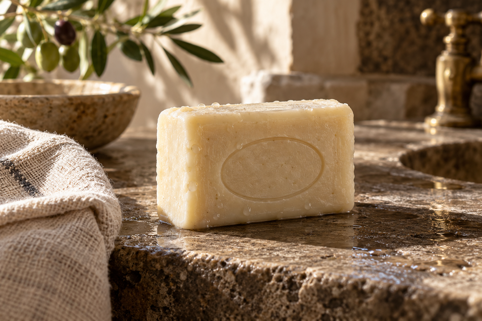
The £5 Object — Product Repositioning & Campaign. Ordinary product. Extraordinary creative department. A low-cost everyday object can still earn a second look. This concept treats an ordinary olive soap bar with the care usually reserved for a luxury launch: tactile stone, honest material detail and beautifully controlled light. The visual direction focuses on desire created by composition rather than a made-up price claim. It is a demonstration of how JKN could reposition an overlooked product through photography, packaging direction and a clear campaign idea. Skills: Product Photography, Art Direction, Packaging Design.
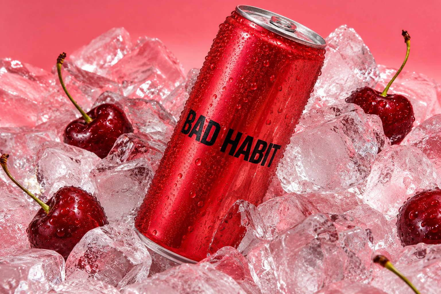
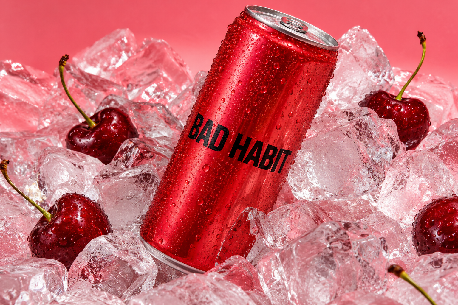
Bad Habit — Beverage Branding & Campaign. Make better bad decisions. A cherry-red can, cold ice and a name with attitude. Bad Habit explores how a fictional drinks brand could stand out without piling claims onto the pack. The visual language is punchy, tactile and playful, with confident lettering and a simple colour system. The hero establishes the mood; the planned extensions show how the same product could work on a shelf, in a customer's hand and across campaign creative. This is concept branding, not a manufactured or launched drink. Skills: Brand Identity, Packaging Design, Product Photography.

Room 83 — Music Identity & Album Art Direction. An album you can see before you hear it. Room 83 is a fictional artist's visual era, built around the intimacy of listening before the spectacle of performing. Warm studio light, analog textures and an unforced portrait give the music a recognisable mood. The concept can extend into cover art, press images, vinyl packaging and a release campaign without turning every asset into a different aesthetic. It demonstrates JKN's ability to develop a visual world around an artist; no recorded album, label commission or audience results are claimed. Skills: Art Direction, Album Cover Design, Editorial Photography.
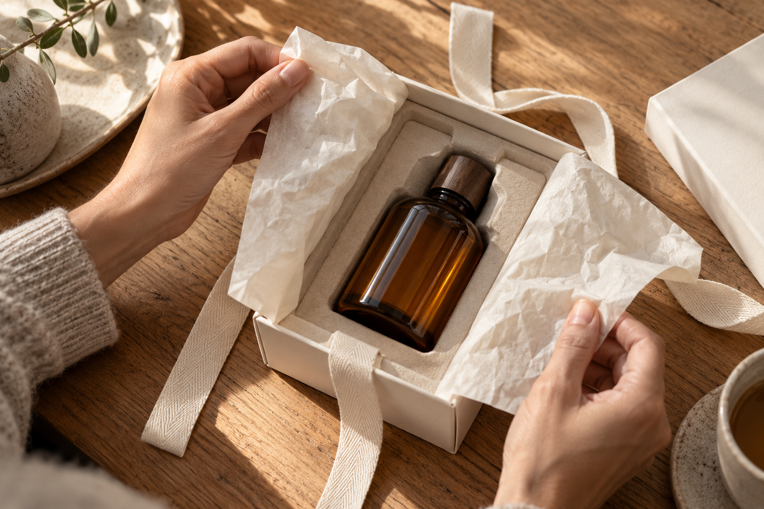
Unwrapped — Packaging & Unboxing Art Direction. The product starts before the box opens. The first touch is part of the product. Unwrapped explores a quiet, considered opening experience through rigid paper, cotton ribbon, soft tissue and an amber bottle. The materials do the work: nothing needs a fake seal, a loud badge or a crowded label to feel thoughtful. The concept shows packaging direction and visual storytelling for beauty, home fragrance or gift brands. It establishes an experience to develop with a real client, rather than a production-ready packaging specification. Skills: Packaging Design, Product Photography, Art Direction.
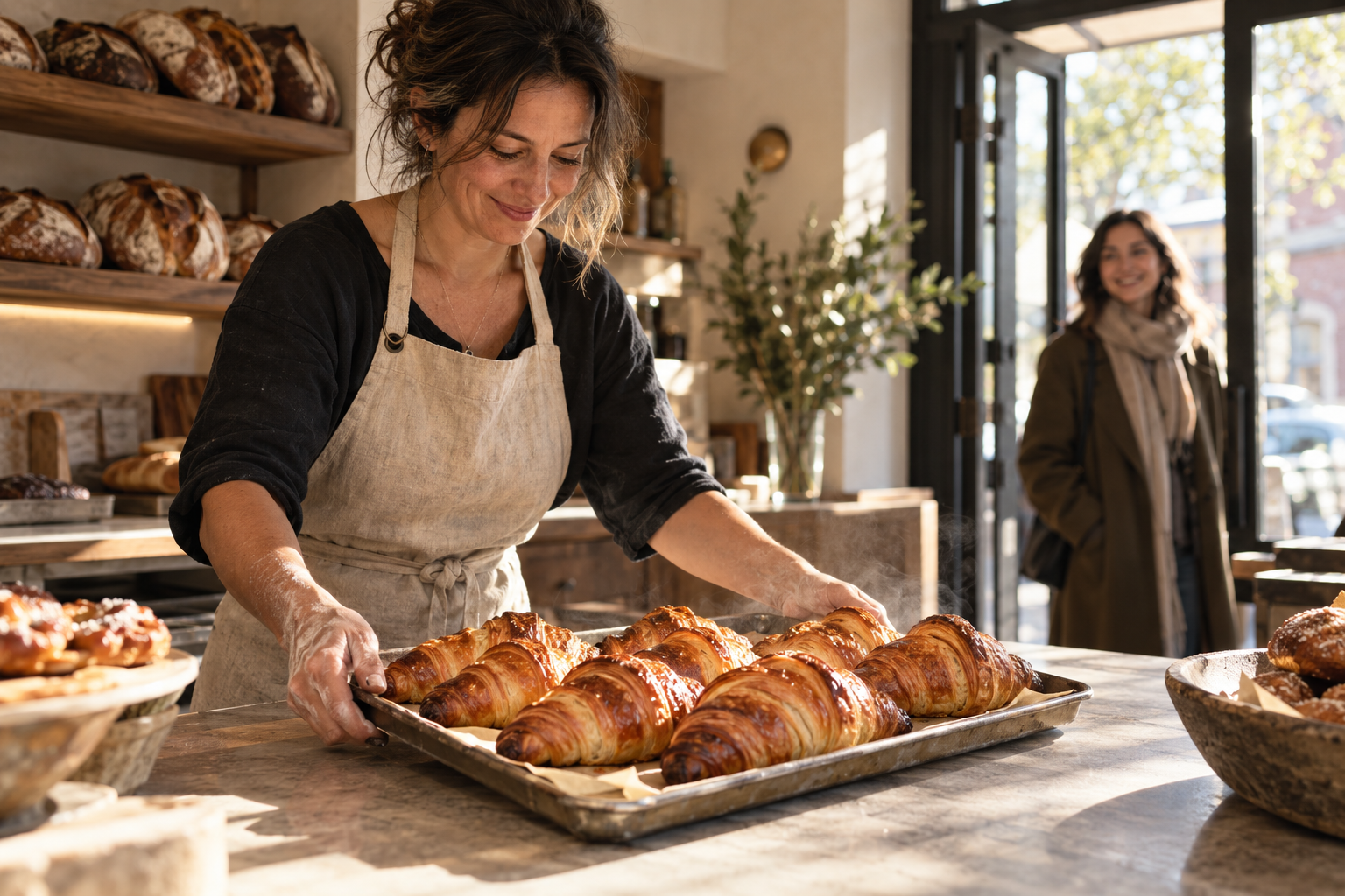
Sunday Service — Bakery Branding & Lifestyle Campaign. Worth getting out of bed for. A neighbourhood bakery should feel like part of someone's Sunday, not a sterile product shelf. Sunday Service pairs warm food photography with the small human rituals around opening time: flour on an apron, a familiar face at the door and pastries fresh from the tray. The direction gives a fictional bakery a welcoming identity with enough character to carry menus, bags, a website and social content. It is an independent concept, with no real venue, menu prices or trading history implied. Skills: Brand Identity, Food Photography, Campaign Design.
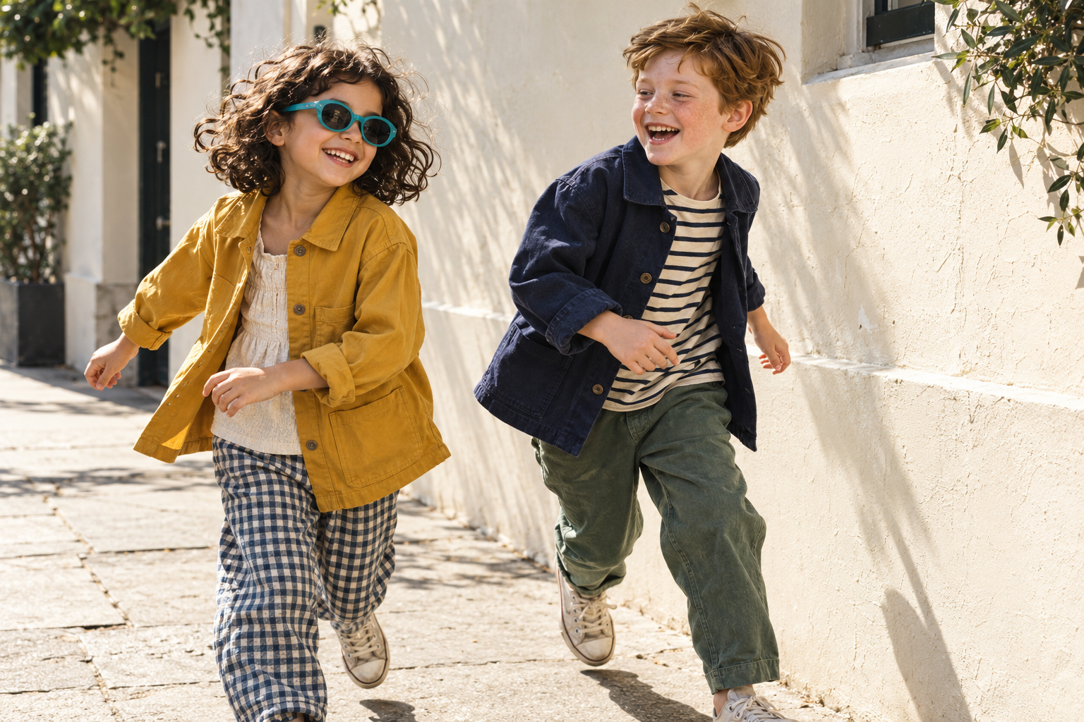
Little Riot — Childrenswear Identity & Campaign. Small people. Massive personalities. Children's clothing has to survive real movement. Little Riot is a fictional childrenswear direction built around laughter, practical layers and the confident personalities wearing them. Mustard, navy and a bright turquoise detail make the collection recognisable without turning the children into miniature adults. The work demonstrates age-appropriate campaign photography, product continuity and a playful brand system for independent fashion labels. The models and garments shown are concept demonstrations, not a photographed commercial collection. Skills: Fashion Photography, Brand Identity, Campaign Design.
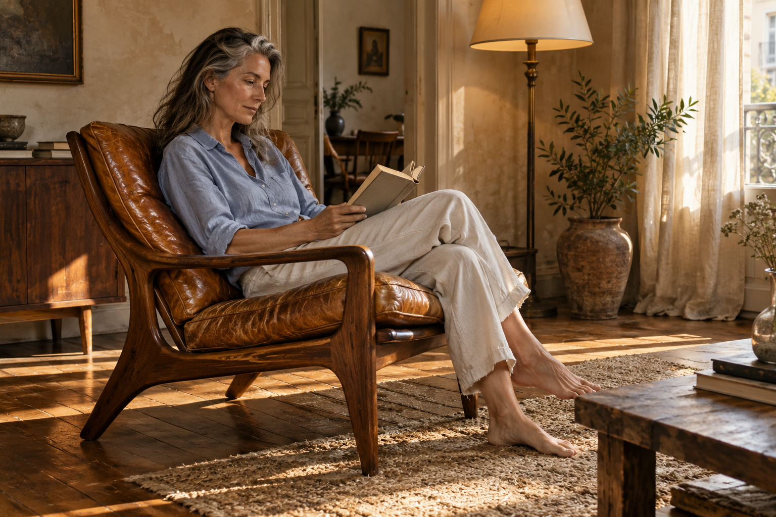
Found. — Vintage Furniture Marketplace Direction. Some things deserve a second room. The best second-hand furniture brings something new to a room. Found. imagines a vintage marketplace with an editorial point of view: worn leather, good timber and pieces that look better for having lived a little. The concept makes condition part of the story rather than hiding it. Photography, listing structure and a calm visual identity work together to make browsing feel curated and useful. The chair is a fictional demonstration; no stock, provenance, sustainability certification or marketplace functionality is claimed. Skills: Brand Identity, Interior Photography, Web Design.
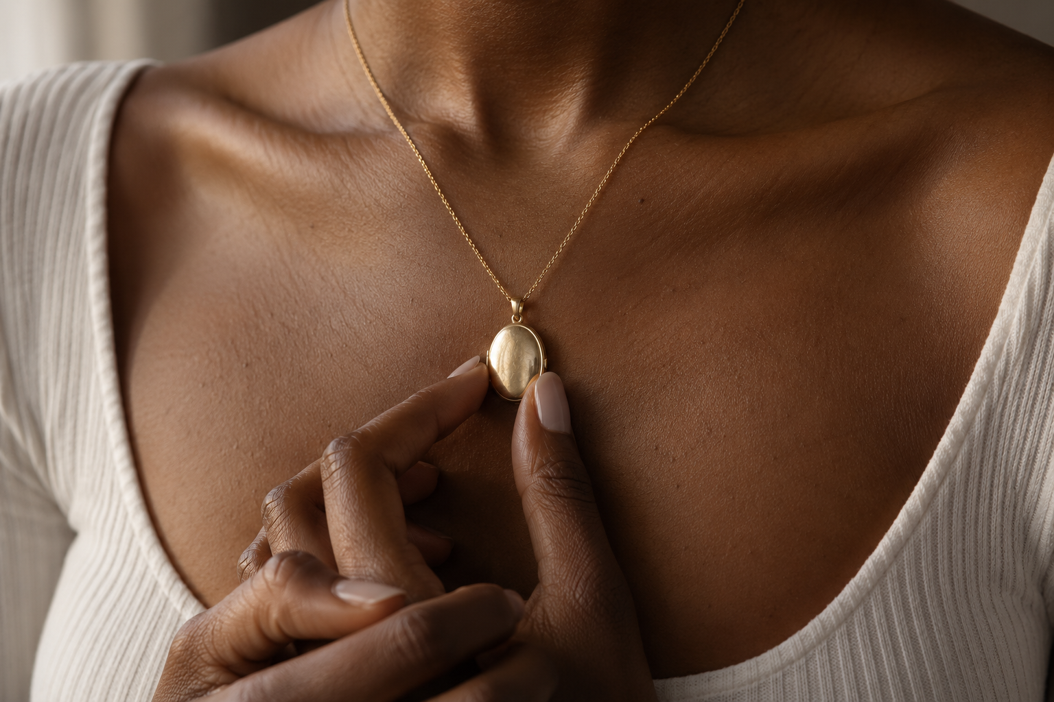
Objects of Affection — Jewellery Storytelling & Campaign. Wear what matters. Some jewellery matters because of who it keeps close. Objects of Affection builds a fictional locket collection around touch, memory and everyday wear. Warm gold and natural skin make the image feel personal rather than performatively expensive. The direction could support product pages, gift campaigns and a story-led identity while keeping the jewellery itself consistent. It demonstrates JKN's approach to intimate product storytelling, with no invented customer story, precious-metal specification or real brand commission. Skills: Jewellery Photography, Art Direction, Brand Identity.
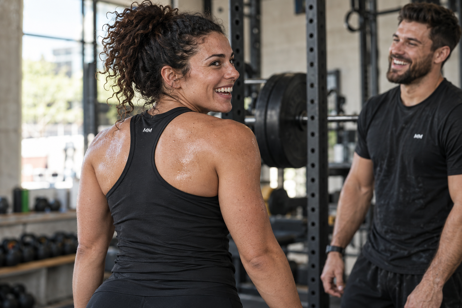
Mass Mode — Fitness Apparel & Campaign Direction. More Muscle Than Manners. Training is serious. Your T-shirt does not have to be. This Mass Mode campaign extension brings the brand's attitude into a believable gym environment: practical kit, ordinary equipment and people enjoying the hard work. Small MM branding keeps the hero wearable; the slogan-led garments belong in the supporting designs where the wording can be controlled. The project demonstrates apparel direction, product photography and social creative. It is new concept imagery for the Mass Mode brand, not evidence of manufactured garments or customer results. Skills: Apparel Design, Fashion Photography, Campaign Design.

Ledger — Freelancer Finance Brand & UX Direction. You started a business. Not a spreadsheet. Freelancers should not need another full-time job to understand their numbers. Ledger imagines a calmer finance platform with clear priorities, useful language and room to breathe. The lifestyle hero brings the relief into view; the supporting interface work will explain the product through straightforward hierarchy and explicitly illustrative data. The concept demonstrates brand direction and interface design, not functioning accounting software, regulated advice or an integration with a real financial account. Skills: Brand Identity, UX/UI Design, Web Design.

Nest — Sleep Brand & Lifestyle Campaign. Your 3pm problem started at 2am. Nest explores the feeling a sleep brand should sell: a room that lets you switch off. Rumpled linen, dawn light and a natural sleeping portrait replace the usual glossy mattress display. The direction gives a fictional mattress brand a calm, credible visual language, with space for real product specifications when they exist. The headline is a campaign idea about everyday tiredness, not a diagnosis or evidence that a mattress treats a health condition. Skills: Lifestyle Photography, Brand Identity, Campaign Design.
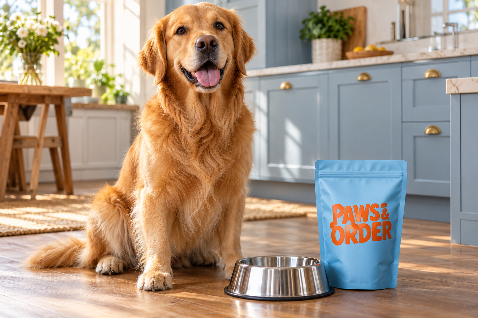
Paws & Order — Pet Food Identity & Campaign. Your dog has reviewed your cooking. A dog-food brand can have a personality without borrowing a cartoon voice. Paws & Order uses an attentive golden retriever, warm kitchen light and a bold blue pouch to make an everyday feeding ritual memorable. The humour sits in the campaign copy; the product stays physically believable and uncluttered. This fictional direction demonstrates pet photography, packaging and launch creative. Recipe, nutritional and veterinary statements would need real approved information before any commercial pack was produced. Skills: Packaging Design, Pet Photography, Brand Identity.
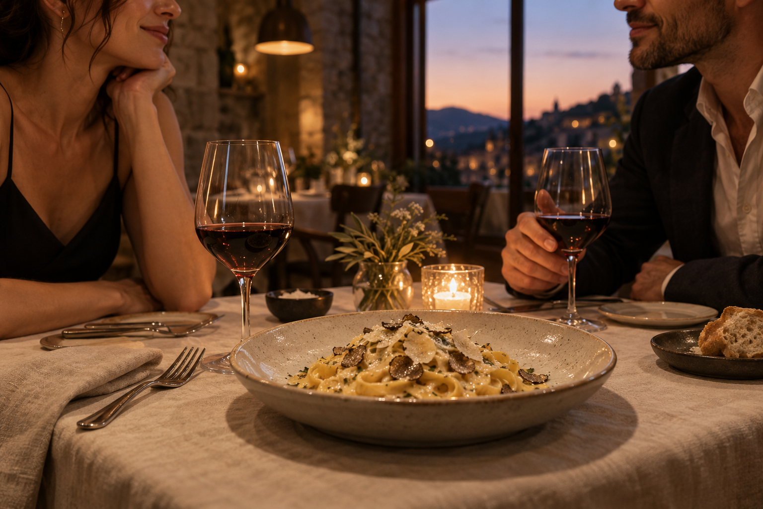
Table for Two — Restaurant Brand & Campaign. Dinner worth dressing for. People book a restaurant for more than the plate. Table for Two imagines a destination venue through the details of an evening worth sharing: warm light, good food and the person across the table. The photography balances appetite with atmosphere, giving a fictional restaurant a recognisable emotional proposition. The direction can carry a menu identity, booking-page concept and social campaign. It does not imply a real venue, chef commission, dish price or existing reservation service. Skills: Food Photography, Hospitality Branding, Web Design.
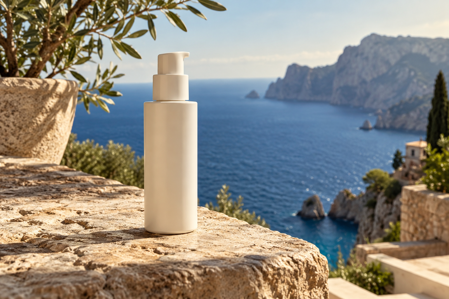
Not From a Studio — Virtual-Location Product Campaign. One product. Six countries. Zero flights. A product can travel visually without the team travelling physically. Not From a Studio is a reference-led campaign method: keep one product consistent while building believable settings around it. The Mediterranean hero establishes the demonstration bottle; the five planned extensions complete the six-setting direction. Every setting is imagined and AI-assisted, with lighting and perspective matched to the product. The work demonstrates location storytelling and compositing, not evidence of travel, real destination photography or delivered client placements. Skills: Product Photography, Compositing, Campaign Art Direction.
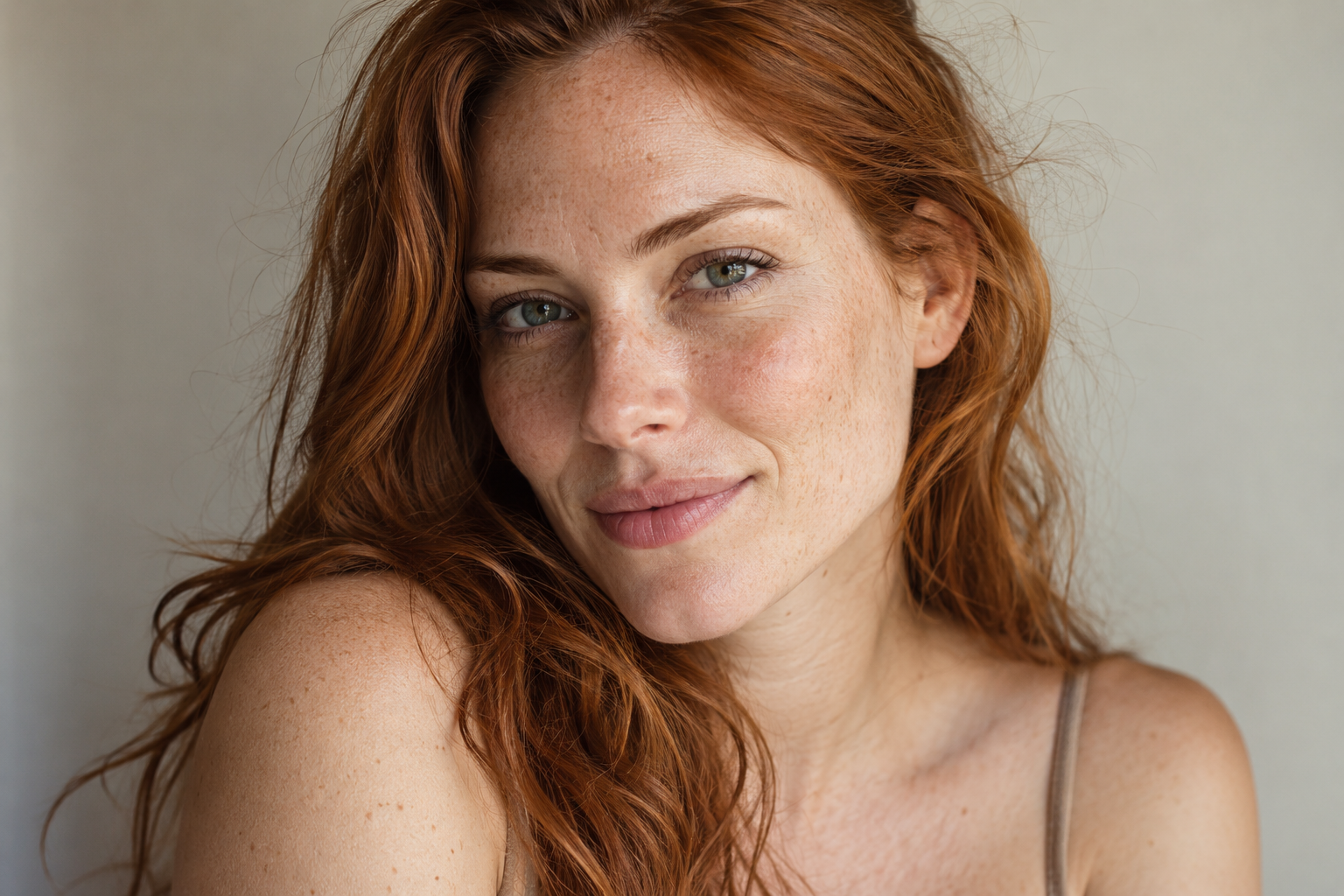
Perfectly Imperfect — Natural Beauty Editorial Direction. Keep the skin. Lose the plastic. Skin is allowed to look like skin. Perfectly Imperfect is a beauty direction that keeps pores, freckles, flyaways and subtle asymmetry in the image rather than polishing away the person. Soft light and a relaxed expression carry the appeal. The concept demonstrates credible portrait art direction and a restrained retouching philosophy for beauty campaigns. The model is fictional; no product efficacy, before-and-after result or endorsement is implied. Skills: Beauty Photography, Editorial Art Direction, Retouching.
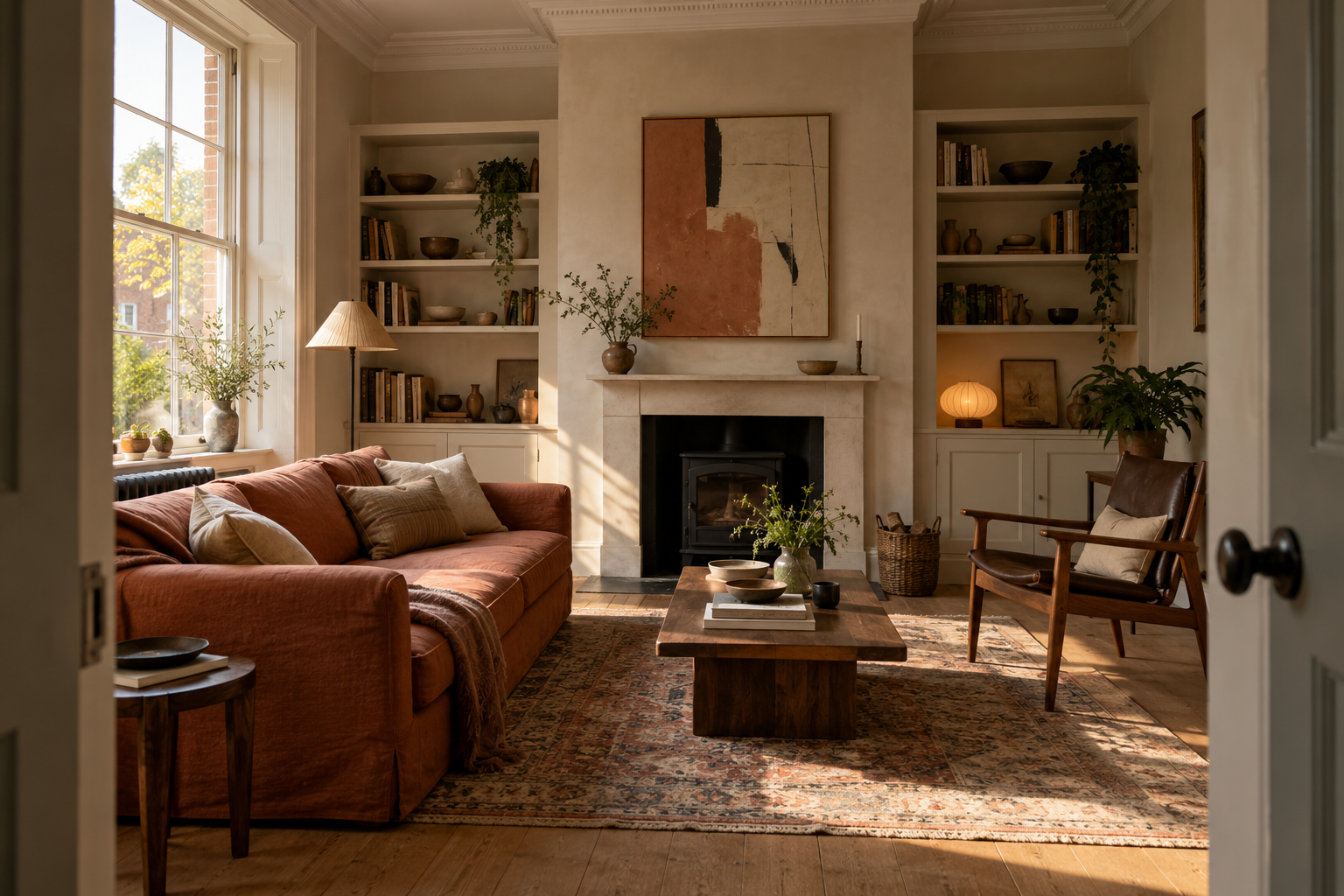
One Address, Five Lives — Interior Styling & Visualisation. Same walls. Different life. A room changes when the person living in it changes. One Address, Five Lives explores five ways of styling the same architectural shell, keeping the window, fireplace, floor and viewpoint fixed while furniture and colour tell a different story. The hero establishes the creative-owner version. This is a study in reference consistency and interior art direction, not photographs of a real property or a construction proposal. The five-owner set must pass an architectural comparison before being presented together. Skills: Interior Visualisation, Art Direction, Interior Photography.
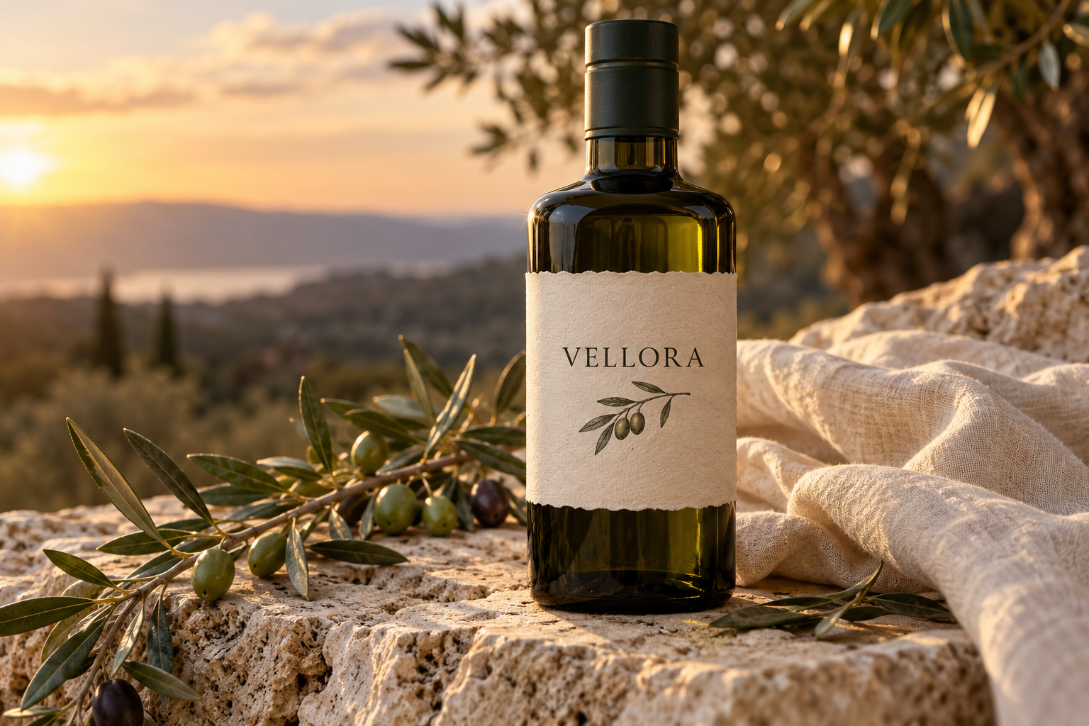
The Other Side of the Label — Story-Led Premium Packaging. Picked up for the label. Remembered for the brand. A label wins the first glance; a coherent brand earns the next one. This direction uses the fictional Vellora olive-oil bottle to explore tactile paper, confident type and a simple botanical mark. The visual story stays restrained, giving the product room to feel credible. The concept demonstrates label architecture, photography and brand storytelling. Product origin, certification, ingredients and legal copy remain unassigned until approved information is supplied; none are invented to make the mockup feel finished. Skills: Packaging Design, Brand Identity, Product Photography.

Her House — Property & Interiors Brand Direction. Property, properly presented. Her House imagines a female-founded property and interiors brand with warmth, competence and a clear point of view. A believable designer portrait sits alongside considered architectural photography, letting the people and spaces share the story. The concept demonstrates brand identity, presentation and a useful digital experience for property professionals. All people and interiors shown are fictional demonstrations; the project does not imply an actual agency, property for sale, valuation or client relationship. Skills: Brand Identity, Interior Photography, Web Design.
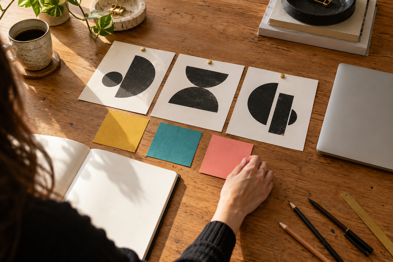
The 24-Hour Brand — Focused Brand Sprint Direction. What could your idea look like tomorrow? A new idea often needs a clear first direction before it needs a huge brand manual. The 24-Hour Brand explores a focused sprint: establish the proposition, choose a visual territory and show the idea in use. The hero captures the working materials behind that decision. The title is a concept for an offer, not a promise that every project or full brand system can be delivered in a day. Scope and timing would be agreed for each real commission. Skills: Brand Identity, Creative Direction, Presentation Design.

Reset — Women's Wellness Brand & App Direction. Your life doesn't need another to-do list. Reset imagines a wellness app that gives women a little space rather than another score to chase. The brand direction is grounded in an ordinary quiet moment, with a soft palette and language that feels supportive without being sugary. The planned interface puts simple choices and easy exits ahead of streaks or pressure. It is a design concept, not a functioning medical or therapeutic product; no health outcomes, diagnosis or clinical endorsement are claimed. Skills: Brand Identity, UX/UI Design, Lifestyle Photography.